
User Interface Guidelines
This page contains guidelines for developing Indico's user interface.
Common elements
This section covers common elements to be used throughout Indico providing examples and snippets.
Icons
Indico uses Icomoon.io web-fonts as vector icons. To embed an icon simply use the following snippet making the class fit the icon of your preference. (*)
<!-- Icon as text -->
<i class="icon-clipboard"></i>

<!-- Link with icon -->
<a href="#"><i class="icon-clipboard"></i> Copy link</a>
Available icons are listed as CSS classes in _icons.scss.
To add new icons to Indico:
- Login in Icomoon.io and start the App
- Import icons and upload selection.json
- Click on Add more icon sets... and add Icomoon Ultimate and WebHostingHub? Glyphs
- Select new icons to be added and click on Font ->
- In Preferences, set icomoon as the font name and download the package
- Extract files from icomoon/fonts and overwrite existing ones in indico/htdocs/fonts
- Overwrite selection.json with icomoon/selection.json
- Append new icon classes from icomoon/style.css to _icons.scss
- Make sure to comply with the license of the new icons and reference their corresponding authors in THANKS.md if needed
(*) Why are we using the <i> tag? Read this: <I> tag for icons?
Buttons
Buttons are intended to be used for providing a way to perform actions.
Regular buttons

Standard buttons:
<!-- Regular button -->
<a class="i-button" href="#">Action</a>

<!-- 100% width button -->
<a class="i-button i-button-fit" href="#">Action</a>

Meaning can be added to buttons with the following classes: accept, danger, highlight, and warning.
<a class="i-button accept" href="#">Confirmation</a>
<a class="i-button danger" href="#">Dangerous Action</a>
<a class="i-button highlight" href="#">Highlighted Action</a>
<a class="i-button warning" href="#">Slightly Dangerous Action</a>
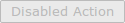
A button can appear as disabled by adding the class disabled. Be wary that this will only affect its appearance.
<a class="i-button disabled" href="#">Disabled Action</a>
Buttons with icons

Icons can also be used in buttons. If the tag is empty a margin-right will be added to the icon automatically.
- With text:
<a class="i-button icon-plus" href="#">Add</a>
- Icon only:
<a class="i-button icon-plus" href="#"></a>
Toolbars

Toolbars usually congregate a set of buttons to be displayed within a block element and can be created with <div class="toolbar">. They come in two sizes: normal and thin. For the thin version, simply add class="thin".
<div class="toolbar">
  <a class="i-button">Add</a>
  <a class="i-button">Remove</a>
</div>
Most of the times it's useful to have buttons visually grouped within a toolbar. For doing so, a <div class="group"> can be nested in the toolbar enclosing all buttons to be grouped. An useful element in order to make clearer what kind of tools the group is a special label button that can be added with class="i-button label". Add class="right" for having groups aligned to the right side of the toolbar.
<div class="toolbar thin">
  <div class="group">
    <span class="i-button label">Participants</span>
    <a class="i-button icon-plus"></a>
    <a class="i-button icon-close"></a>
  </div>
  <div class="group">
    <span class="i-button label icon-reading"></span>
    <a class="i-button">Assign paper</a>
  </div>
</div>
Dropdown buttons in toolbars
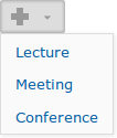
Dropdown buttons can be added to toolbars. This can be achieved adding data-toggle="dropdown" to a button element and placing a <ul class="dropdown"> element as next sibling. The arrow class adds a small arrow that makes more clear the button is going to display a dropdown list.
<div id="dropdown-menu" class="toolbar">
  <a class="i-button arrow icon-plus" data-toggle="dropdown" href="#"></a>
  <ul class="dropdown">
    <li><a href="">Lecture</a></li>
    <li><a href="">Meeting</a></li>
    <li><a href="">Conference</a></li>
  </ul>
</div>
Finally, for initializing the dropdown action, just activate dropdown() in the enclosing element.
<script type="text/javascript">
  $(function() {
    $('#dropdown-menu').dropdown();
  });
</script>
Input elements
Radio and Checkboxes

For generating radio/checkboxes compliant with the style of buttons there is a special case of grouped buttons on a toolbar. Using a dropdown button in the same group causes radio buttons to now work as expected.
<div class="toolbar">
  <div class="group i-selection">
    <input type="checkbox" id="emailLog" name="view_filter" checked>
    <label for="emailLog" class="i-button">Email</label>
    <input type="checkbox" id="actionLog" name="view_filter">
    <label for="actionLog" class="i-button">Action</label>
  </div>
</div>
Text boxes can be inserted in toolbars with the following snippet.
<div class="toolbar">
  <input type="text"/>
</div>
Real-time filter
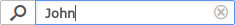
In order to create a nice-looking filter, first, create a toolbar for it.
<div class="toolbar thin">
  <div class="group">
    <span class="i-button label icon-search"></span>
    <input id="filter" type="text" placeholder="Filter users..."/>
  </div>
</div>
Then, widgetize the input with javascript:
$("#filter").realtimefilter();
This component allows the configuration of some parameters:
$("#filter").realtimefilter({
  callback: function() {
    // Function that will be called on filtering
    // Filtering takes place after any change occurring in the input
  },

  validation: function(e) {
    // Function that will check if the content is valid
    // Callback function won't be called unless the input validates
    // By default this function returns true
  },

  // Allows clearing the input pressing ESC or clicking a small X icon
  clearable: true,

  // Defines default value of the input
  // Clearing the input will assign this value
  emptyvalue: "0",

  // Class applied to <input> when validation fails
  // It will be updated on input change
  invalidclass: "invalid",

  // Waiting time (in ms) to execute the filtering callback function
  wait: 250;
});
Also, it provides public methods that can be accessible at any point:
// Force filtering programmatically
$("#filter").realtimefilter("update");

// Check validation state of the input
$("#filter").realtimefilter("validate");
Editable area of input fields

This widget, inspired in Gmail Contacts, is useful for letting a user add/remove/edit/sort an undetermined number of fields in a reduced space. It keeps track of field values, IDs and ordering in a list that can be accessed by getInfo(). Existing fields can be loaded passing a list by setInfo(info). To distinguish existing fields from new fields, the new ones' posses negative integers as ID.
Examples to generate field area widgets:
$("<div></div>").fieldarea()
$("<div></div>").fieldarea({ui_sortable: false})
List of options:
- fields_caption: Sets the placeholder text. Default: "field".
- parameter_manager: ParameterManager? object to check the input. Default: undefined.
- parameter_type: Input type expected by the parameter manager. Default: "text".
- ui_sortable: Allows drag&drop of fields to sort them. Default: false.
User hotkeys:
- TAB/ENTER: Moves to the next field.
- ESC: Undo.
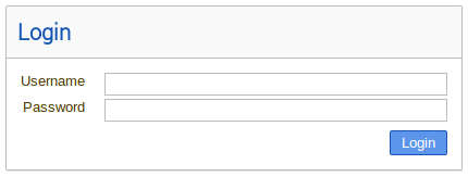
Forms

A basic Indico form is set with the following classes:
- i-form, for the <form> element, together with the horizontal or vertical class, depending on the desired layout.
- form-group, to wrap a label and a field of the form, representing one row. The classes horizontal and vertical can also be used here in case a row needs different orientation that the form.
- form-block, to represent a construction block of the form (label/field).
- form-label, a label wrapper.
- form-field, a form field wrapper.
Some other classes used in special cases are:
- form-field-description, for the <p> below the field in case there is a field description.
- form-label-middle, to align the label in the middle in case the field is a single line field.
- form-label-empty, in case the field has no label (or the label is on the right for horizontal forms).
- checkbox-label, for a checkbox that needs the label on the right.
<form method="post" action="" class="i-form horizontal">
  <div class="form-group">
    <div class="form-label form-block form-label-middle">
      <label for="name">Name</label>
    </div>
    <div class="form-field form-block">
      <input name="name" type="text">
      <p class="form-field-description"><em>The name of the room</em></p>
    </div>
  </div>
  <div class="form-group">
    <div class="form-label form-block">
      <label for="description">Description</label>
    </div>
    <div class="form-field form-block">
      <textarea name="description"></textarea>
      <p class="form-field-description"><em>The description of the room</em></p>
    </div>
  </div>
  <div class="form-group">
    <div class="form-label form-block form-label-empty"></div>
    <div class="form-field form-block">
      <input name="notify_admins" type="checkbox" value="y">
      <div class="checkbox-label">
        <label for="notify_admins">Notify admins</label>
      </div>
      <p class="form-field-description"><em>Should chat administrators receive email notifications?</em></p>
    </div>
  </div>
  <div class="form-group">
    <div class="form-label form-block"></div>
    <div class="form-field form-block">
      <input class="i-button big highlight" type="submit" value="Save">
      <a href="#" class="i-button big">Cancel</a>
    </div>
  </div>
</form>
Tables
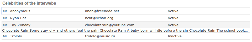
Indico table elements are set with the class i-table table, tr and td. For specifying the header of the table simply add the class to a h3 element right before the table. Rows can be expanded and highlighted on mouse over by adding class="interactive". This will make the next row to be shown/hidden on click. For this to work properly, such row needs the class weak-hidden
<h3 class="i-table">Awesome Table</h3>
<table class="i-table">
  <tr class="i-table interactive">
    <td class="i-table">Mr. Tay Zonday</td>
    <td class="i-table">chocolaterain@youtube.com</td>
    <td class="i-table">Active</td>
  </tr>
  <tr class="i-table weak-hidden">
    <td class="i-table" colspan=3>
      Chocolate Rain. Some stay dry and others feel the pain.
    </td>
  </tr>
</table>
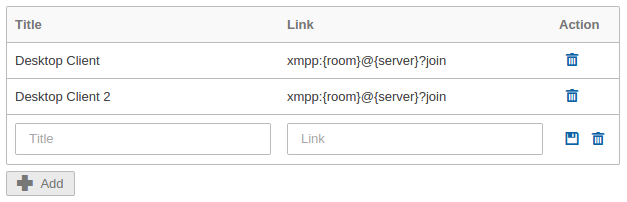
Table widget

If you need a table with action buttons for each row (ex: to add/remove rows), you can use the i-table-widget class. To keep the Action column width to the minimum, add the action-column class to the appropriate <th>.
<table class="i-table-widget">
  <thead>
    <tr>
      <th>Name</th>
      <th>Link</th>
      <th class="action-column">Action</th>
    </tr>
  </thead>
  <tbody>
    <tr>
      <td>Mr. Tay Zonday</td>
      <td>chocolaterain@youtube.com</td>
      <td><a class="action-icon icon-remove" href="#" title="Delete"></a></td>
    </tr>
    <tr>
      <td>Mr. Monty</td>
      <td>python@example.com</td>
      <td><a class="action-icon icon-remove" href="#" title="Delete"></a></td>
    </tr>
    <tr>
      <td><input type="text" class="table-input" placeholder="Name"></td>
      <td><input type="text" class="table-input" placeholder="Link"></td>
      <td>
        <a class="action-icon icon-disk" href="#" title="Save"></a>
        <a class="action-icon icon-remove" href="#" title="Delete"></a>
      </td>
    </tr>
  </tbody>
</table>
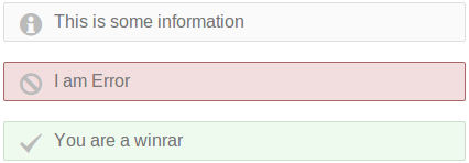
Message boxes
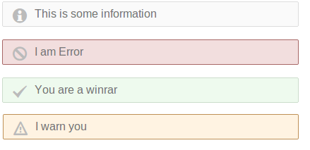
If you need to highlight a message alert of some kind, in Indico we provide different message-boxes styled in color and icon according to the type of message. As for now, we have the following message box styles:
- info-message-box
- error-message-box
- success-message-box
- warning-message-box
To make use of them:
<div class="info-message-box">
    <div class="message-text">This is some information</div>
</div>
<div class="error-message-box">
    <div class="message-text">I am Error</div>
</div>
<div class="success-message-box">
    <div class="message-text">You are a winrar</div>
</div>
<div class="warning-message-box">
    <div class="message-text">I warn you</div>
</div>
Boxes
Indico provides standard boxes with the class i-box. They come in two flavors: normal and titled. A normal box is just that and it should be use whenever some collection of elements should be visually tied together. A titled box is a normal box with a header containing a title and alternatively a description. Use the following snippet to start fleshing out your boxes.
<div class="i-box titled">
  <div class="i-box-header">
    <div class="i-box-title">
      Titled box
    </div>
    <div class="i-box-description">
      The titled box looks neat
    </div>
  </div>
  <div class="i-box-content">
    Fill me with love
  </div>
</div>
Also, within a SASS context, i-box class can be extended to fit special cases like in the following example.
.my-i-box {
  @extend i-box;
  @extend i-box.titled;

  min-width: 9000px;

  .i-box-title {
    color: pink;
  }
}
Colors
Indico provides a palette of official colors in order to enforce style consistency across the whole system. They are defined as SASS variables in _palette.scss. Every time you need to assign a color, simply use one of the official ones as in the following example:
.highlight {
  background: $blue;
}
Each base color comes in three flavors: normal, dark and light. If you need a broader range of shades, use the SASS built-in functions lighten($color, $amount) and darken($color, $amount) with $color-variation as amount. This approach provides 9 shades per base color.
.selected-row {
  background: darken($light-gray, $color-variation);
}
This palette is still in development. If you need a base color not yet defined, please, consider creating a new variable in _palette.scss.
$green: #0F0;
Good reference sites for choosing new colors:
- Adobe Kuler: Advanced color-picker
- Colllor: A palette generator
- COLOURlovers: Community generated palettes
- XKCD survey: 954 most common RGB monitor colors
Hover color (deprecated)
In a list of items, such as a list of users or categories, or others, we should use a color when the mouse hovers the element. This can be done through the CSS :hover rule.
There are two cases: if clicking on the item will do something, or not.
- If a click will do something, we should use a light orange color (#FFF6DF):
- If not, we should use a light gray color (#ECECEC):
Selection color (deprecated)
Also in lists of items, we should use a green color (#CDEB8B) for selected items.
Selection color:Red warning color (deprecated)
For lines of text which represent a warning, we should use the "Indico red" color (#881122), and possibly font-weight: bold
This is a warningGreen success color (deprecated)
For lines of text which represent a successful ajax operation, we should use a green color (#118822)
This is a warningAttachments (16)
- action.png (925 bytes) - added by aavilesd 2 years ago.
- buttonflavors.png (6.6 KB) - added by aavilesd 2 years ago.
- disabledbutton.png (1.7 KB) - added by aavilesd 2 years ago.
- dropdown.png (3.1 KB) - added by aavilesd 2 years ago.
- iconbuttons.png (838 bytes) - added by aavilesd 2 years ago.
- radio.png (1.9 KB) - added by aavilesd 2 years ago.
- table.png (18.2 KB) - added by aavilesd 2 years ago.
- toolbar.png (3.7 KB) - added by aavilesd 2 years ago.
-
fieldarea.png
(5.8 KB) -
added by aavilesd 2 years ago.
Field area widget
- realtimefilter.png (2.0 KB) - added by aavilesd 2 years ago.
- message-boxes.png (7.3 KB) - added by aavilesd 19 months ago.
- i-box.png (4.1 KB) - added by aavilesd 19 months ago.
- message-boxes.2.png (9.7 KB) - added by tpapini 17 months ago.
-
table-widget.png
(11.2 KB) -
added by iliastrichopoulos 11 months ago.
Table widget
-
table-widget.2.png
(10.4 KB) -
added by iliastrichopoulos 11 months ago.
Table widget
-
i-form.png
(20.1 KB) -
added by iliastrichopoulos 11 months ago.
i-form
Download all attachments as: .zip